✦

DMetal
Crafting resilience, style, and grace, turning cold metal into your personalized space
.png)
.png)
.png)
My Role
UX/UI Designer responsible for user research, ideation, visual design prototyping, testing
Team
UX Designer (Me)
Developer
Tools
Figma
HTML5, CSS3, JavaScript
Timeline
Oct 2023 - Jan 2024
Deliverable
Responsive Web Design
Overview
What is DMetal?
DMetal is a small company based in Kosovo, a country in the Balkans, specializing in the creation of customizable metal frames for various furniture items. DMetal offers a range of metal products, including chairs, tables, and shelves. The company is committed to providing quality metalwork, and its clients often seek customization options for their specific needs.
Problem
DMetal clients invest significant time navigating various DMetal social media platforms for contact and product details, causing decentralized communication challenges. The restricted language options further result in the loss of international clients.
Solution
DMetal's responsive web design centralizes communication through a Floating Action Button (FAB), uniting diverse user contact channels. The FAB eliminates the need for navigating multiple platforms, enhancing efficiency in client-DMetal interactions. Multiple language options accommodate a global audience, preventing potential client loss.
DISCOVER
Problem Space
I collected information using the following methods:
Interviews
I interviewed 1 DMetal stakeholder and 2 DMetal Clients. These interviews helped me understand the who, what, where, when, and how of the problem.
Multi-lingual Research
I read through 5 articles related to cross-cultural and multi-lingual UX. This taught me that flags ≠ languages and how culture and language impacts design.
Competitive Analysis
I conducted a competitive analysis on 6 Kosovo-based websites to gain an understanding of local design trends, user expectations, and industry practices.
DISCOVER - BREAKDOWN
Understanding Severity + Consequences
What are the consequences of the current problem?
Loss of Customers + Revenue
Continued communication challenges and language differences may result in frustrated customers, leading to a potential loss of clients and revenue. The stakeholder mentioned losing customers due to outdated contact information on DMetal social media during the interview, highlighting the financial impact.
Poor Reputation
Persisting issues with scattered communication channels and unupdated information could contribute to a perception of poor organization within DMetal. In a country where reputation holds significant value, this may affect how potential clients perceive DMetal, potentially leading to a negative impact on the company's standing.
Communication Challenges
Continued communication challenges might lead to delays and dissatisfaction among clients. This can create a barrier to effective business-client interactions, potentially hindering the growth and success of DMetal.
DISCOVER - BREAKDOWN
Root Cause
So, how did this become a problem? DMetal's scattered communication approach did not work anymore as the company started to grow.
Difficulty Managing Multiple Platforms
DMetal used multiple platforms for communication and product showcase. They struggled to manage and update information across multiple social media platforms, leading to missed calls, delayed responses, and inefficient communication with clients.
Absence of Multi-lingual Options
DMetals social media platforms were only in Albanian. International clients that did not speak Albanian did not understand the companies product details, leading to a decrease in the number of international clients.
DISCOVER - BREAKDOWN
Competitive Analysis
I looked into Kosovo websites and here are some considerations:
Design Aesthetic and Layout Similar to North American Websites
I discovered that Kosovo websites share a design aesthetic and layout similarity with North American websites, eliminating the need to adapt to a completely new UI/UX style. This included a similar navigation structure, color schemes, and content organization.
Currency + Measurement Adaptations
One notable difference in Kosovo websites lies in the uniform use of Euro (€) as the primary currency and metric units (kilometers, centimeters) for measurement. This adaptation is important when presenting product prices, frame dimensions, and other quantitative information.
Familiarity with Floating Action Buttons
There is a familiarity with Floating Action Buttons (FABs) in Kosovo, particularly in the context of contact-related actions. This affirms users existing comfort and understanding of this UI element
DEFINE
Defining
Based on the interviews, research, and competitive analysis, we found that the application needed to place emphasis on contact options.
Problem Statement
"How can we design the DMetal app to showcase their work and create seamless communication in two languages, placing emphasis on user contact options given the absence of purchasing features on the platform?"
User Preferences + Pain Points
Preferred Communication Channels
Users prefer to contact using Viber, WhatsApp, FB Messenger. Email is almost never used. Calling is the most preferred way to communicate, then texting. Though the over-reliance on calling as the primary communication method can be inconvenient for users who prefer texting.
Supported by Response: "My clients mainly prefer Viber and normal texting and calling. Some of them use Facebook Messenger and WhatsApp, but much less."
Product-Specific Inquiries
Most of the users come looking for a specific product and product detail (color, size).
Feeling Disconnected
The most common languages spoken by DMetal users is Albanian, followed by English. Many of the younger generation from nearby countries wanted an English options but this wasn't available.
Emphasis on Location
Users in the country prioritize in-person meetings and often rely on public transportation. Knowing the business location, especially accessibility via public transport, is crucial.
Supported by Response: "They also want to know the location of the business. A lot of people use public transportation, so they want to know if they can stop by DMetal using public transportation. This is really important!"
IDEATE
Deciding on Solutons
I worked with the developer during this stage to make sure our idea was feasible. We filtered out ideas based on technical constraints.
IDEAS
PREFERRED COMMUNICATION CHANNELS
---> Floating Action Button - External Applications (Viber, WhatsApp, FB Messenger, etc)
EMPHASIS ON LOCATION
---> Integration of Google Maps API
FEELING DISCONNECTED
---> Language Changing Menu
PRODUCT-SPECIFIC INQUIRIES
---> Sort and filter option on products page
Rationale Behind Solution
Constraints
No in-app communication
WHAT THIS MEANS: Users will experience communication through external applications, providing a familiar and seamless experience. This decision simplifies the development process and aligns with the widespread use of these external platforms for communication.
No in-app purchasing feature
WHAT THIS MEANS: This means there needs be an emphasis on contacting the company. DMetals goal is to get more users to contact them and eventually order from them. CTA's should focus on contacting the company.
No Search Bar, Sort and Filter Instead
WHAT THIS MEANS: On the products page, users won't have a search bar. Instead, they'll find options to sort or filter products based on criteria like price and color, simplifying the browsing experience.
Requirements
Allow Multiple Contact Options
Allow language change
Allow Users to Filter Products
DESIGN
Designing the Solution
Pseudo-localization Implementation
Pseudo-Localization Implementation:
- Discuss how you employed pseudo-localization techniques during the design process to simulate the appearance of the interface in different languages.
- Explain that this step was taken to proactively identify and address potential challenges related to text expansion, contraction, and overall layout adjustments.
Design Exploration
Communication Hub
_edited.jpg)
Verdict: Not Chosen
Pros: More options for communication
Cons: The paradox of choice is a significant consideration in UX design. In the case of FAB, it's a good idea to limit the available options to avoid overwhelming users. From the interviews, I learned that WhatsApp is the least preferred. I offered the four most essential communication channels.

Verdict: Not Chosen
Call Button Icon
Pros: This icon is more direct and instantly recognizable as a call-related action, aligning well with the option to make a call.
Cons: It may not represent the text or messaging options as clearly.

Verdict: Chosen
Speech Bubble Icon
Pros: This icon may be associated with messaging or communication in general, which aligns with the options DMetal provides (Viber, Facebook Messenger, Text).
Cons: It might not explicitly convey the option for making a phone call, which is a key communication method for DMetal.
Language Menu
.png)
Verdict: Not Chosen
Not chosen because flags do not equal languages. This is something I learned while doing this project!
.png)
Verdict: Not Chosen
Not chosen because it doesn't specify the country or region associated with the language. Users may also be unfamiliar with language codes.
.png)
Verdict: Not Chosen
Although Albanian has two dialects (Tosk and Gheg), this could be perceived as too detailed for general language selection. Users are generally more familiar with regional identifiers, such as Kosovo, rather than specific dialect names like Gheg.
.png)
Verdict: Chosen
Chosen because it specifies the region associated with the language. Considering that DMetal operates in Kosovo, "Albanian (Kosovo)" seems more aligned with the geographic context and is likely to be clearer for users. Icon may also be useful.
Wireframes
I used Figma to create simple mobile and web wireframes. Here are a few of them.
_edited.jpg)
.png)
.png)
FINAL DESIGNS
DMetal
.png)
.png)
Design + Prototypes
I used Figma to design the high-fidelity prototypes. Aspects of the application are shown below.

Communication Hub
The "Communication Hub" – a floating feature persistently available on all pages. It provides quick access to general calling, texting, Viber, and Facebook Messenger for seamless interaction.
Language Menu
A menu enabling users to switch between Albanian and English. Specifically tailored to our Kosovo operation, it provides a clear "Albanian (Kosovo)" option. Additionally, language translation is integrated, ensuring a straightforward and practical user experience.

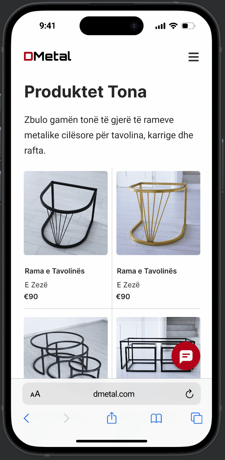
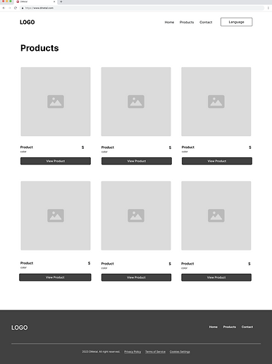
Products Page
TEST
Testing + Evaluations
I tested on 3 users. 1 moderated in person usability testing. 2 remote usability test done over video call.
What worked?
- Users like the specified region on the language options. There was a clear appreciation for the multi-lingual aspect of this application.
- They found the Google Maps API to be very useful. Many users use public transportation so they like knowing if there are bus stops near businesses.
What didn't work?
- Users felt the FAB icon could have been replaced with a phone icon for better understanding.
- A few translations needed adjustments, though users still understood text.
- Some users confused static icons for calling options.
REFLECTIONS
What I Learned
Communication
DMetal is a small company located in Kosovo, a country in the balkans.
Other learnings
sdsdf