top of page
✦
R E S H U F F L E
Guiding people through their career transition
.png)
_iphone13promaxgraphite_portrait.png)
Responsive Web Design for Reshuffle
Timeline
2 Months
deliverable
My Role
UX Designer
Responsive Web
platform
Adobe XD
What inspired me?
This project was inspired by “The Great Reshuffle”. When the COVID-19 pandemic struck the world, more than half of workers who quit their job switched their occupation or field of work, hence the name reshuffle. This got me thinking if our current technology is helpful for career-changers, and my research showed me the lack of guidance for career-changers in top career websites.
So... what's the problem?
I stumbled upon an article by Forbes that had these interesting statistics. Many people changing careers have trouble identifying their transferable skills and finding jobs where their skills would apply.
.png)
What does our user Thomas think?
.png)
Thomas experiences many emotions on his journey
.png)
The competition LACKED GUIDANCE FOR CAREER-CHANGERS
I analyzed some of the most popular websites surrounding careers, jobs, and industries. I found that these websites produced articles for career change help, but not any tools. The articles were also very generic and not personalized at all.
And the competition isn't helping Thomas
.png)
Time to build a site map
.png)
Doing more research + interviews on our wireframes
I conducted an in person moderated test on my wireframes along with more online research to gain more insight.
Research Questions
1. What barriers are in the way of a career-change?
2. Do you know what you're looking for in your next job/career?
3. How do you evaluate your transferable skills?
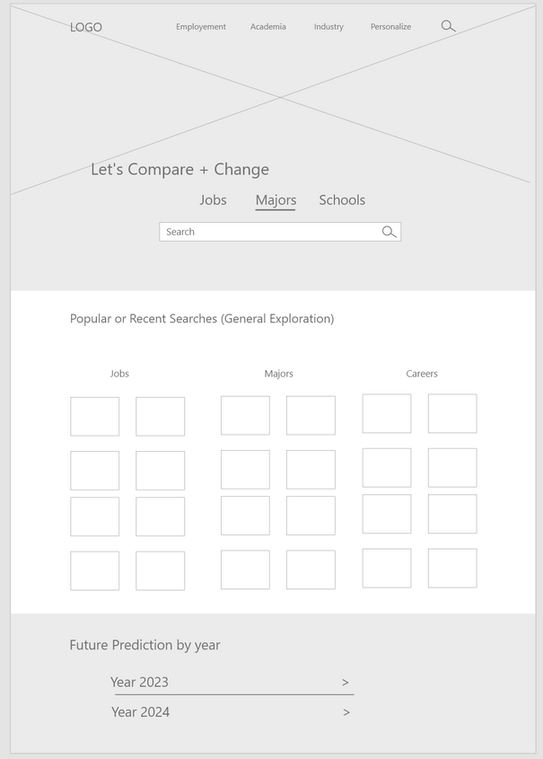
Now the low fidelity wireframes
SKRRT! Slow down. We have some setbacks
.png)
Let's make a few changes
1. Side by Side Comparison
After users used my wireframes, they preferred option B over A. Users stated they liked the side by side comparison over colors. As they scrolled down, they found it easier to compare.
.png)
2. Compressed inputs
Since some users knew what they wanted in their career and others did not, I changed the inputs section to include one input section ("In my next job I want..."). This is optional and expands so users can input specifics (salary range, hybrid work, etc). If users are not sure what they want in their next career, this section can be ignored so they can freely explore. This also saved space.
.png)
3. Learned Skills First
One of the themes from my research was a lack of confidence in users. Drawing attention to skills that need improvement first discourages users as it makes them feel that they "have nothing to offer". Though eliminating the skills that need improvement completely is not a fair evaluation either. I decided to highlight the skills users already have first, then show the areas that need improvement. The goal of this change is to focus on the "good" and not the "bad". A career change is already difficult enough.
.png)
4. Tool Clarification
The last area I changed was the home page. After showing users the high fidelity prototypes, some users still had some level of confusion for this new "what-if" feature. For users that did not understand the "what-if" and the compare tool, I added a short description for each.
.png)
The final product
.png)
A little design system
Measuring Success
How did I test the effectiveness of this design? Since I was limited with the number of participants, I did a usability test on 4 people and asked my participants to fill out a questionnaire after finishing test tasks so that I could quantitively measure the success of the design. The metrics include the awareness of transferable skills and the most useful tools in my designs.
.png)
Most importantly, what did I learn?
1. The value of teachers and mentors. Throughout this project, I have self-taught and worked on everything independently. Although the internet has been incredibly helpful, I definitely would’ve benefited greatly from a mentor or a teacher.
2. Focus on accessibility. Adding more icons, larger text, audio features, and shortcuts. This area needs more research since my participants did not need accessibility features or any accomodations.
bottom of page
.png)
.png)
.png)
.png)


.png)
_iphone13promaxgraphite_portrait.png)